13/05/2016

Baby Spoons 2/4

Baby Spoons
When a devastating earthquake struck the Noto Peninsula in 2007, a number of lacquerware workshops were badly affected.  Stock was damaged, equipment was broken and in some cases workshops and storehouses collapsed.  It was a depressing time as it only added to the troubles that lacquerware makers were already confronting.

Despite being one of Japan’s most prestigious lacquerware production centres, the demand for fine items of Wajima lacquerware had been falling for sometime.  Partly fuelled by rising costs, the situation was exacerbated by cheap imports and hastened by the general change in life style of the people, a trend which had been gathering pace over the past twenty to thirty years.

Something had to be done.  There needed to be a focus, something to bring people together to overcome the general predicament that the lacquerware makers found themselves in.

A group of twenty makers of all ages, abilities and skills banded together.  What were they to do?  After long discussions and much encouragement from Yuko Yokoyama—a dedicated supporter of Japan’s traditional crafts and lacquerware in particular—it was decided to hold and exhibition in Tokyo.  What were they to make?  Baby Spoons.

In Japan since the eighth-century it has been a custom to celebrate when a baby’s milk teeth come through, which is generally around one-hundred days after birth.  Called Okui Hajime, this custom marks a mile stone in a baby’s life.  The making of a baby spoon seemed appropriate, especially as it was not only a feeding spoon but also a symbol of new life, a new beginning and the beginning of something to look forward to.

Below are the second five of the twenty Baby Spoons which were made and exhibited in Tokyo and Europe.  They are an expression of something that Wajima needed.  A new hope.


Junei Shioji:  Flowers—Hana
This floral trio is full of meaning. Picking up on the symbolism of purity, humility and simplicity is the white rose (left).  Although often translated as plume, the ume (middle) is actually a Japanese apricot—white associated with men and the red variety with women.  Along with the cherry, the apricot is one of Japan’s most representative and loved flowers.  The Chrysanthemum is the insignia of the Imperial Family—a symbol of dignity and strength.  For Junei what these flowers symbolise is what she would hope a child is blessed with.


Akio Sakaguchi:  Moon and Rabbit—Tsuki Usagi
What do you see when you look at the Moon?  The Japanese see a rabbit pounding sticky rice, perhaps for a New Year celebration.  The meaning is clear—peace and happiness as well as a full stomach is what we would all wish for, especially for a newborn child.

Delicately rendered maki-e work on a red background with embellishments of gold powder.


Akiko Mizutani:  Let’s Eat—Itadakimasu
Akiko has achieved so much with so little.  The little mouse is a piece of wit and below the little boy or girl is a hope for bonds of friendship.  The bowl and chopsticks—not wanting for food of course.  The shirt/blouse a hope for life’s essential clothing.  A house—a place to live in safety.  Work and the will to develop is symbolised by a pencil.  The dove? Peace, health and the willingness to help others.  And a four-leaf clover for good luck.  All these things are wished for and drawn with brevity and skill.


Naomi Kamata:  Carp Swimming up Stream—Nobori Koi
What an elegant design.  The simplicity of this long slender spoon with its delicate depiction of a carp struggling against the flow of a river is so Japanese—ascetic and yet so rich in quality.  And it gives the impression of where it is heading—the open mouth of a baby eagerly waiting for the next spoonful.  The symbolism is as simple—the hope of success in life and to live with conviction.


Hiroyuki Oka:  A Dove on Wheels—Hato-guruma
Like all of these spoons, the use of a toy dove signals a hope for peace and happiness—what could be more satisfying than watching a small child playing happily with a treasured toy.

Hiroyuki has rendered this toy in gold and silver powder maki-e work and chips of mother-of-pearl.


All photographs courtesy of the Wajima Urushi Tanteidan—The Wajima Lacquer Study Group

Do feel free to pass on the address of this blog to anyone you think will be interested.  Or post it on a social media site.  Should you wish to leave a comment, please do so by clicking on the comment mark at the bottom left of this or any of the other posts.   If you have found this blog interesting, why not become a follower.  Thank you.

07/05/2016

Baby Spoons 1/4

Baby Spoons
When a devastating earthquake struck the Noto Peninsula in 2007, a number of lacquerware workshops were badly affected.  Stock was damaged, equipment was broken and in some cases workshops and storehouses collapsed.  It was a depressing time as it only added to the troubles that lacquerware makers were already confronting.

Despite being one of Japan’s most prestigious lacquerware production centres, the demand for fine items of Wajima lacquerware had been falling for sometime.  Partly fuelled by rising costs, the situation was exacerbated by cheap imports and hastened by the general change in life style of the people, a trend which had been gathering pace over the past twenty to thirty years.

Something had to be done.  There needed to be a focus, something to bring people together to overcome the general predicament that the lacquerware makers found themselves in.

A group of twenty makers of all ages, abilities and skills banded together.  What were they to do?  After long discussions and much encouragement from Yuko Yokoyama—a dedicated supporter of Japan’s traditional crafts and lacquerware in particular—it was decided to hold and exhibition in Tokyo.  What were they to make?  Baby Spoons.

In Japan since the eighth-century it has been a custom to celebrate when a baby’s milk teeth come through, which is generally around one-hundred days after birth.  Called Okui Hajime, this custom marks a mile stone in a baby’s life.  The making of a baby spoon seemed appropriate, especially as it was not only a feeding spoon but also a symbol of new life, a new beginning and the beginning of something to look forward to.

Below are the first five of the twenty Baby Spoons which were made and exhibited in Tokyo and Europe.  They are an expression of something that Wajima needed.  A new hope.


Hitomi Yoshida:  Grapes and Squirrels—Budo Risu
The symbolism of the title is simple—grapes grow in abundance on a vine and the number of off-spring squirrels have are considerable.  Both are therefore seen as auspicious and enhance the idea of abundance and hence not wanting.  Can you see the squirrel?

The motifs are rendered with a maki-e technique using gold powder and a limited use of pigments.


Etsuko Osaki:  Cherry and Acer—Sakura Momiji
The joy of being a child born in Japan where the ever-changing pageant of the seasons is so glorious is celebrated on this spoon.  The design and rendering is as sensitive as it is hoped the child will become.

Maki-e techniques predominate along with the use of flat gold slivers and mother-of-pearl.


Ryuji Ikehata:  I Love You—Ai Rabu Yu
The message here could not be more simple—just the mere mention of a child instils feelings of love and something to be adored.  “It was the first thing that came into my head” says Ryuji, “and to use an image of an angle (cherub) seemed fitting”.

The pigments mixed with true lacquer are applied with great delicacy while the lettering is slightly raised in gold powder and true lacquer.


Koushi Kado:  Phoenix—Fenikkusu
The spoon is emblazoned with a symbol of life and immortality—an arabesque based on the phoenix plant.  For the child it also represents a cry of encouragement with which to send them on their way in life.

The finely rendered maki-e arabesque is embellished with small pearls.


Yoshinori Shibayama:  Dragonfly—Tonbo
Because a dragonfly always flies forwards and never retreats, it can be found on samurai helmets and is regarded with a great deal of respect in Japan for its tenacity and strength.  It is hoped, therefore, that a child will possess the same steadfast nature and not fear whatever task with which he or she is confronted.

The dragonfly wing is chased and the bowl of the spoon is aglitter with chips of mother-of-pearl.


All photographs courtesy of the Wajima Urushi Tanteidan—The Wajima Lacquer Study Group

Do feel free to pass on the address of this blog to anyone you think will be interested.  Or post it on a social media site.  Should you wish to leave a comment, please do so by clicking on the comment mark at the bottom left of this or any of the other posts.   If you have found this blog interesting, why not become a follower.  Thank you.

04/05/2016

On Design—Shin Gyo So, Formal Informal


The lanterns standing outside this stone mason’s workshop in Wajima display a full range of formal and informal styles.
Formal Informal
In the creative arts in Japan there are what are known as kata.  It can mean a mould or a pattern or a style or type and even a convention or a stereotype.  On occasions it is simply a shape.  Most of these words in English refer to real things—“to pour lead into a mould”.  In other cases the words describe situations—“there is a pattern in his behaviour”.  The word can even be used to describe nothing more than a size—“I’d like to buy a large fridge”.  From a design and creative arts point of view, kata is taken as a convention, a form or arrangement to be followed, representing something almost as if it were a universal code that the Japanese especially recognise as having significance.

A very informal almost rustic style of lantern 
that corresponds to the So from Shin Gyo So
Such conventions, too, can be found in various aspects of society.  If you are going to play golf in Japan you need to be wearing the “right” clothes.  This phenomena is, of course, not exclusively a Japanese trait.  Since the success of the British cycling team at the 2012 London Olympics, the roads in the countryside where I live have become racetracks or training courses for those who would aspire to follow their heroes.  They all have the “right” cycling wear and are well equipped with light weight racing bicycles and helmets, too.  This is not a jibe as such behaviour.  It is simply evidence of just how committed this new breed of cyclists are, and the same is true in Japan.  The would-be golfer is similarly passionate and anxious to look the part.

A page from a character manual shows the “true” Shin rendering at the top right of each block and the So writing in the lower lefthand corner.  From Kakikata Jiten (A Dictionary of How to Write Characters) published by Nobarasha, Tokyo, 1978.
But how do these conventions work in design?  Taking just one of them let’s consider Shin Gyo So, which for simplicity’s sake can be translated as Formal-Informal.  The expression is often used to describe three styles of writing, or a gradual transition from a formal style through to a more relaxed and flowing style of calligraphy.

An example of formal through to informal arrangements of stones.  From Nihon no Toshikukan (Urban Design in Japan) by Teiji Ito and others, published by Shokokusha, Tokyo (www.shokokusha.co.jp).
Although not exactly, this transition could be likened to the difference between very precisely hand written copper plate English script through a more fluid style, which finally becomes a quite loosely written and characterful handwriting.

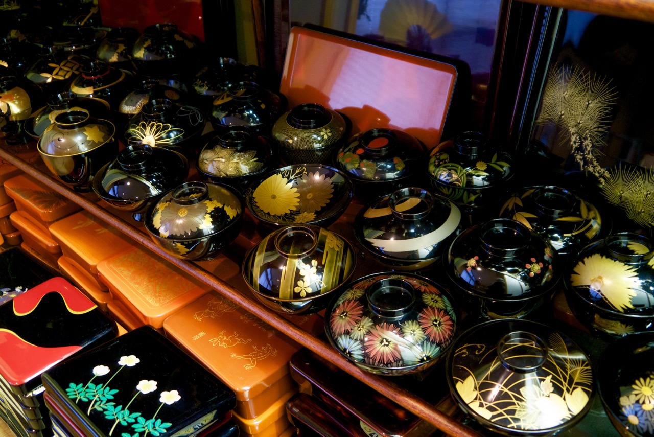
A range of soup bows from the lacquerware workshops of Tohachi in Wajima.  All display a very formal, elegant character.
This kind of transition can be seen in the way garden features are arranged or expressed.  It is also evident in some forms of poetry and even in styles of swimming particular to Japan.

An example of a very informal, hand painted soup bowl lid from the archive of the Local History Museum in Ninohe, Iwate Prefecture.
The stones of a garden path might be rigidly arranged and therefore seen as formal.  Using the same stones but in a far less rigid layout would be seen as informal and therefore verging on the rustic.

Hand painted in a very informal way, this soup bowl too comes from the archive of the Local History Museum in Ninohe, Iwate Prefecture.
Having such kata as a guide when designing something could, I suppose, be likened to the way a composer has different keys at his disposal when writing a piece of music—a minor key to create a melancholic atmosphere, a major key for a happier passage.  However such conventions are used each one can be part of the designers palette of features and design devices through which to express style and atmosphere.  It could be done through a lantern, a piece of lacquerware or even with a garden path.

Bill Tingey Photo © Copyright except where noted.

Do feel free to pass on the address of this blog to anyone you think will be interested.  Or post it on a social media site.  Should you wish to leave a comment, please do so by clicking on the comment mark at the bottom left of this or any of the other posts.   If you have found this blog interesting, why not become a follower. Thank you.

22/04/2016

Wajimaya Zenni Two of Two

The planting, rock and lantern at the entrance follow the style and brevity of the other enclosed garden spaces within the plan of the building.
Wajimaya Zenni—Testimony to Culture
In addition to being an architectural gem, the Wajimaya Zenni machiya is testimony to the artistry, skill and dedication of those who have produced fine lacquerware in Wajima over the centuries.

Wajima lacquerware is renown for its durability.  It is equally well known for the artistry of its decorations.  But few people are aware of just how much effort was put into selling the ware.

There are still hundreds of registered traditional crafts in Japan that have been in existence for more than one-hundred years.  Many of these are small concerns employing a few craftspeople supplying a limited and now dwindling market.

Wajima is lucky because while production levels of true lacquerware have regrettably fallen in recent times, it still has an “industry”, which contributes in no small part to the economy of the city and the Noto Peninsula as a whole.  It is the pride of Wajima and of the nation but how long has this been the case?

The old storehouse flanks what is now the main entrance.  The weather boarding helps to protect the plastered finish of its walls.  In the event of a fire in the vicinity, the boarding can be removed, so that the plaster could really do its job—to be fireproof.
Rather than wait for customers to come to them, agents from Wajima lacquerware workshops actively sought buyers.  It began during feudal times when Japan was ruled by a Shogun and the country was divided into fiefs administered by feudal lords.  The countless wealthy nobles, warriors and even merchants with status who occupied the upper echelons of society at the time all needed lacquerware and the market was ready to be tapped.  Tea aficionados, poets, performers and other cultured people too, were always in need of something new and interesting with which to thrill their friends and associates, although the representatives of the lacquerware workshops in Wajima did not have free rein and unrestricted access to this stable market.

Under the eave of the entrance this pierced illustration is a triumph—so much said with so little.
There was actually plenty of competition.  Lacquerware production centres up and down the country, some of which still exist, would certainly have fended off outsiders.  Each one had its own strongly guarded techniques and distinctive designs and patterns but none had the durability to match that of Wajima lacquerware.

Inside the entrance at the front of the building, the glow of the true lacquer and the delicacy of the screen-work is breathtaking.  The rooms to the left are arranged one behind the other, while the passageway leading to the back of the building flanks them to the right.
Sending representatives on marketing trips for two to three months of the year to actively sell the creations turned out by Wajima’s workshops had what was probably an unexpected benefit.  The skilled and very knowledgeable representatives of the workshops became a kind of clearing house for matters of style, culture and fashion among the nobility and intelligentsia of the country, simply because they visited so many people who mattered.  They were trusted and tended to have direct access to the aristocracy and were welcomed by the high and mighty.

The maki-e plaque, the paper on the fusuma screen, and the grill transom set the tone of quality of the first room.  Open transoms are common in traditional buildings, as they allow a much needed movement of air during the hot, humid summer months.

This fusuma sliding screen with its translucent paper and fine screen of wood ensures visual privacy.  It also prevents anyone standing to listen to any conversation beyond the screen.  A shadowy silhouette of an eaves-dropper standing by the screen would alert people beyond of their presence.  There just might have been some need for such secrecy.
It was the highly accomplished and knowledgable nushi, literally “those who applied the lacquer”, who had the skill and knowledge and could therefore take on the job of selling.  It was these men who also found it necessary to at least try to better themselves, so that they might pursue if not actually match the sophistication of their clients.

To describe this kind of decoration as “fretwork” is a mistake, as it is not cut with a fretsaw from a single piece of wood.  It is assembled from many pieces of wood to form a pattern that could perhaps be called “fretwork”, given its delicacy.
The rooms of the Wajimaya Zenni machiya became “classrooms” where staff were tutored.  It was here too perhaps that they passed on information about the needs of the customers they had visited while on their travels, so that the workshop could develop products to better meet their client’s needs.

The intricate fretwork close to the ceiling is almost exactly mirrored by the way that the shade of the lamp is constructed—not immediately noticeable but an indicator of just how much care has been taken with the interior.
And so this pattern of sales and production continued and was copied by other craft producers.  Today there are workshops that have there own outlets, while others sell through departments stores or specialist shops.  Some lacquerware makers sell through galleries and yet still others only make items to order.  All of what these dedicated professionals do is a testimony to culture.  And so is the Wajimaya Zenni machiya.

Bill Tingey Photo © Copyright

Do feel free to pass on the address of this blog to anyone you think will be interested.  Or post it on a social media site.  Should you wish to leave a comment, please do so by clicking on the comment mark at the bottom left of this or any of the other posts.   If you have found this blog interesting, why not become a follower.  Thank you.

18/04/2016

Wajimaya Zenni One of Two

The narrow facade gives no hint of actually how deep the site is.  The gable end with a lean-to extension is typical of machiya in the region.

Wajimaya Zenni—Architectural Gem
Japan is made up of four main islands and some 4,000 smaller ones.  In area it is only marginally larger than the State of California and only a little bigger than Italy.  The amount of land which is readily habitable, however, is small.  Roughly 80% of the population live on 18% of the land area and most of that is along a coastal strip.  The population of more than 126 million is living at a density of some 347 people per Km2 (897 per mi2), almost all in urban areas.  Compared to the Netherlands where some 500 people live on each square-kilometre, Japan is better off but do any of these statistics help to explain why the traditional buildings in Wajima are built so closely together?  The Japanese themselves do often refer to their country as being semai or “small and narrow”.  So is that one of the reasons?  Do they all feel that every speck and spot of available land must be used to the greatest effect?  Sometimes it certainly seems so.
A plan of a typical machiya  to be found in Kyoto combining a domicile and work-place.  The street is to the right and the most private rooms are to the left at the back of the site.  The three openings ensure that the interior is well ventilated, well lit with natural light and has pleasing views into garden spaces.

The sliding paper screen door gives access to the corridor, which extends to the back of the property.  It would be used by household members but the main wooden door would only be opened for the privileged or to bring some large object undercover.

In old, well established villages, towns and cities all over Japan many buildings conform to historical plot lines and are very close together.  In some places land taxes were based on the width of frontages, which gave rise to a distinctive urban building plan.  Resigned to a narrow frontage there was, however, nothing stopping householders building premises reaching far toward the back of a plot.  This can famously be seen even today in the more traditional districts of Kyoto.  Buildings with such plans are called unagi no nedoko meaning the “place were eel’s sleep”.  Such buildings are often homes as well as places of business and are generically called machiya.  Literally this translates as “townhouse” but the term in English refers to a “tall, narrow traditional terraced house with three or four floors”.  Unlike a machiya, townhouses are seldom homes and places of work.

Toward the back of the property a simple garden
characterises the open space in front of the main storehouse 
to the right.  Here too light and air gain access to the interior.
The narrowness of the plots is, of course, a drawback.  During the hot humid summer months in particular any breath of air is welcome and openings in the plans of machiya facilitate this.  Wajimaya Zenni machiya is no exception.  Built in 1910 and having fallen into disrepair, it was extensively renovated in 1990.  Its overall plan is typical of a machiya—closed in on both sides, narrow and long—and punctuated by open spaces, which at least provide some welcome air and daylight to penetrate the interior.

The rooms of traditional buildings are generally illuminated by the light which ducks under the eaves and is then reflected off the lightly coloured tatami matting.  With this particular building the builder has sort to maximise what little light enters one of the “garden courtyards” by using a white plaster plinth at ground level to reflect a little more precious light into one of the main reception rooms.

The delicate screen-work helps demonstrates the status of the space and also provides a degree of privacy—the interior was a stage of whispers and animated silhouettes, which might only have had form but no identity to most members of the household.
The white plastered plinth at ground level helped to reflect what little light there was on a dull day into a reception room.
The elements of this simply designed garden would be as actors on a stage, changing their appearance with the light through the day and seasons, taking on a new guise with a shower of rain or flakes of snow.  The garden is an encapsulation of nature framed by screens and openings, and different every time it is visited.  Like a camera we capture a moment in time and leave something of ourselves there to be visited at a future date.


This particular garden courtyard is dominated by a large lantern, very little planting and flat boulders.  The flat stones are a common feature in each of the open spaces within the plan and are most effective—not too overpowering and yet they contribute to the character of these open spaces into which rain and snow may fall.


A composition of true lacquered timbers and plaster—the more public space flanking the partitioned rooms extending to the much more private spaces toward the back of the site.
Being a “house of true lacquer” most of the exposed timbers are lacquered.  The interior glows and with soft natural lighting the overall impression is restful and calm.  The sense of space is considerable despite the narrowness of the site.  This may be due to the way that each of the spaces are only partitioned from each other with fusuma—paper covered sliding screens.  Also, the loosely enclosed spaces arranged one behind the other from the front to the back of the property are all flanked by a space like a thoroughfare with a lofty ceiling.  From the main front entrance footwear can be worn in this corridor acting as a passageway for household members and for those engaged in the workshop toward the back of the site.

The location is special and the limitations of the site were used to advantage.  The building is a gem.

Wajimaya Zenni is open from nine till four except Wednesdays and from 29th December to 3rd January.  It is located close to the waterfront at 1-82-3 Kawai-machi, Wajima City.  The main building is not open to the general public, although special viewings can be arranged. There is, however, a gallery where products can be viewed.

Bill Tingey Photo © Copyright


Do feel free to pass on the address of this blog to anyone you think will be interested.  Or post it on a social media site.  Should you wish to leave a comment, please do so by clicking on the comment mark at the bottom left of this or any of the other posts.   If you have found this blog interesting, why not become a follower.  Thank you.

08/04/2016

Out and About on the Noto Peninsula

At the main gate to the most sacred part of the temple compound, stone, wood, metal and nature combine to excite the senses in a subtle yet satisfying way.
At Sojiji….
Formally one of Japan’s most prominent Zen Buddhist temples, Sojiji still maintains an air of restrained grandeur.  It was originally founded in 1398 but a fire right at the end of the nineteenth-century was devastating and the main administrative functions were then moved to a temple in Yokoyama.

The earthquake of 2007, however, also took its toll but thankfully much was saved and repairs are ongoing.  A walk around the grounds reveal interesting vignettes, many of which are peerless while others are variations of similar assemblages to be found at temples up and down the country.  Nevertheless, the somewhat secluded location combined with the arrangement of the buildings is engaging.

Under the shelter of the gate, open-work screens add character to our passage through to the inner compound.  The ageing wood is rugged almost rude against the vivid green of newly unfurled leaves of an acer.
Weathered wood, acer leaves, stone and tiles as if on a stage-set.  Each tells a story.  Each are as they are only for that fraction of a second as the shutter opens and closes.
The main entrance to the Worship Hall is made all the grander with is Chinese style Kara-hafu gable and carvings.  The main roof beyond betrays the enormity of the space of the hall it covers.

Inside the Worship Hall and expanse of tatami matting is regimentally arranged.  The way the light reflects off the tightly woven igusa reed covering adds further to the interest of the arrangement.  Beneath the reed is tightly bound rice straw, which gives slightly as we walk across it.
Although Britain is well known for its antiques, it is shabby-chic or vintage items that are currently so fashionable.  This door epitomises the style.
A collection of materials which speak “quality” and should age gracefully.  A namako-kabe storehouse wall with its raised plaster grouting to dark stone tiles is a common finish for such buildings.  What is it called in Japanese?  It is a “sea cucumber wall”.  My guess is that it was named by a plasterer or by some cheeky carpenter and stuck.  Beyond glazed roof-tiles, wooden boards and boulders create a more rustic and less severe array.

Bill Tingey Photo © Copyright

Do feel free to pass on the address of this blog to anyone you think will be interested.  Or post it on a social media site.  Should you wish to leave a comment, please do so by clicking on the comment mark at the bottom left of this or any of the other posts.   If you have found this blog interesting, why not become a follower.  Thank you.

03/04/2016

Tin Shinkansen


Over the cab reads, "Wajima, a happy place!" and "Lower the taxes!"
A bit of fun
Born in 1872, William Heath Robinson had actually wanted to be come a landscape artist but soon realised that such a career would not pay the bills.  So, he turned to book illustration.  Things went well to begin with but his main publisher suddenly went bankrupt forcing Robinson to seek other outlets for his work.  Knowing that some of the smart magazines at the news stands in the early part of the twentieth-century paid well for large intricate and humorous illustrations, he started to draw for all he was worth.

His illustrations of crazy contraptions, peopled by deceptively ordinary folk caught the imagination of the British public and sealed his success.  Having well drawn people in them was pivotal.  It tricked the viewer into thinking they were looking at an illustration of something “real” while effectively speaking it was an illusion.  The figures help to make the unbelievable believable, at least until we really look carefully.  Although immaculately drawn, Robinson often depicted absurd, overly complex machinery, although complexity per se was not enough for him.  His devices were often cobbled together, forming an assemble of various unrelated parts, bits and pieces that did the job but would not usually be allied or even share the same domain.  It was this and his popularity that finally resulted in his name entering the English language—Heath Robinson:  ingeniously or ridiculously over-complicated in design or construction.

You may ask where is all this is leading?  Well, the “Tin Shinkansen” modelled after Japan’s iconic high-speed Bullet Train exactly fits the expression—it’s a bit Heath Robinson!  Well, yes but in this case it is not necessarily a condemnations.  Those who dare to do something out of the ordinary are actually making a statement, producing something that is a game changer, a creation that may promote a shift in the way people think and consider the world around them.

Ryoanji temple garden, Kyoto
Some of Japan’s most famous designers and architects have done just that.  Although we do not know exactly who “designed” the famous stone garden at Ryoanji Temple in Kyoto, for instance, it has certainly made its mark.  A number of buildings by Kenzo Tange and others in Japan have changed people’s ideas about architecture and influenced countless other architects the world over.

Two of the venues designed by Kenzo Tange for the 1964 Tokyo Olympics.
Will the Tin Shinkansen have the same effect?  Its doubtful.  It does, nevertheless, make a difference to the city-scape of Wajima.  Some call it detrimental.  I call it “a bit of fun”.  Something to relieve the less than genial streetscapes of some parts of this capital of true lacquerware and by which many cities in Japan could also benefit.

Postcard held by Stevenage Museum in their archive.
The collection of ephemera in Wajima reminds me of a building I knew as a child.  The Woodcarver’s Cottage that used to stand beside the main trunk route between London and Scotland was a landmark and something completely out of the ordinary.  The garden as well as the walls of the cottage were decorated with figures, birds and animals.  A Santa was attached to the chimney and a witch on her broomstick floated against the sky from the gable end wall.

They were all made by a Mr. H MacDonald but sadly time has swept them all away.  It is, however, still remembered affectionately by elderly locals and inevitably the neighbourhood where it once stood is a sadder place without it.

So, let’s raise a hurrah for Heath Robinson and Wajima’s Tin Shinkansen and to all those who seek to make a difference, something to break the mould and something to raise a laugh or at the very least a giggle.

Bill Tingey Photo © Copyright except where noted.


Do feel free to pass on the address of this blog to anyone you think will be interested.  Or post it on a social media site.  Should you wish to leave a comment, please do so by clicking on the comment mark at the bottom left of this or any of the other posts.   If you have found this blog interesting, why not become a follower.  Thank you.